
What is Collection #1?
‘Collection #1’ marks the first genuine effort to transform my digital creations into physical artworks. Until now, nearly everything I've ever made has been squirreled away on various hard drives, with only a handful of low-resolution glimpses appearing on Instagram. It’s quite a thrill to finally produce something tangible—something that is hopefully worthy of a place on someone's wall, and reflects the creative journey I’ve been on.
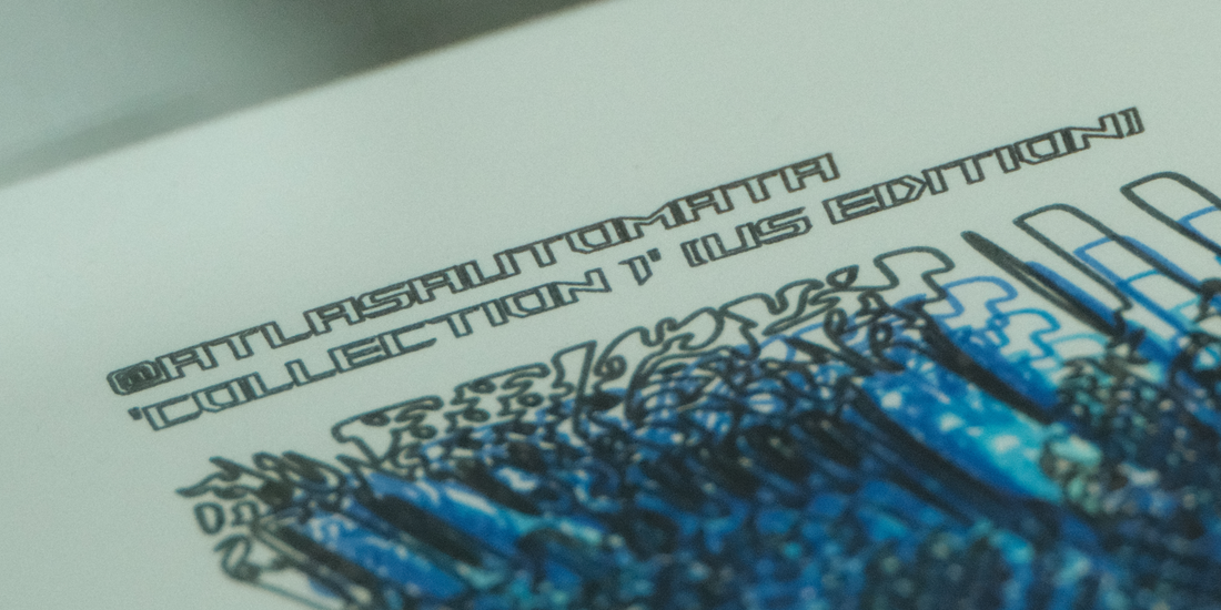
Each piece in Collection #1 (And collection #-1)* is 9" by 12" in size and made with 2-ply Smooth Bristol Paper, and takes on-average around 4 hours for me to complete the process of using the pen plotter to create the drawing. (The active drawing time, and the cumulative distance the pens traveled on the page is featured in the sign-off text on the artwork) On the rear, there is a heat-printed certificate of authenticity that features another unique low-res generative artwork, as well as a holographic sticker.
For this collection, I started with what seemed like a fairly mundane cellular automaton. However, by overlaying two different outputs, it revealed some interestingly balanced combinatorial effects. I spent quite some time adjusting parameters, experimenting with ways to convert the blocky, pixel-based outputs into continuous lines, and testing various scales and pen types, until I found a process that felt right. In the end, I opted for a prime number grid size just to give it that extra mathematical aspect.
A little fun fact: with the parameter set I chose, there are roughly 10^276 possible unique outputs—although many of which wouldn’t necessarily look that interesting! I focused on selecting the most crisp examples that really showcase the automaton’s potential for complex, combinatoric patterns. But who knows what else is lurking in that truly vast computational space? (Honestly, the allure of not knowing what I could discover in these vast unexplored computational spaces is what draws me to spend so many hours working on this stuff!)
I tried out a range of colour-ways, and eventually settled on a blue aesthetic. Green did spring to mind initially (partly inspired by the look of old-school computer code and The Matrix), but it felt a bit too on-the-nose. Blue, by contrast, seemed to bring a fresher quality to the artwork. I have also produced one edition in a red colour-scheme to use as a special give-away to promote the launch of the website on my personal Instagram.
Thank you for being here, and being interested enough to read about this collection: as I am only just getting started, I kept the collection size to a lean eight pieces, but I have other sets of work currently in development, and am looking at aiming for a ~monthly release schedule moving forward.
 (Framed Example of the AP Edition 'Negative Two of Eight')
[*Note regarding Collection #-1]
Detailed on the 'help' page is information about how my collection numbering is going to work moving forward. Essentially the dilemma I had was balancing having an online presence, with having a physical presence at various art shows with sufficient artworks to sell in person. I settled on a system that greatly satisfies both the dilemma, and my mathematically inclined mind; each collection is going to have a counter-part in the negative numbers, which uses the same aesthetic and process, and contains the same number of (individually unique) pieces - which will not appear for sale on the website, and will only be available for purchase physically.
So this is something I want to be transparent about. The eight artworks you see for sale online still comprise the first collection, but the negative first collection also exists, and contains another eight unique pieces that will have the same aesthetic. When I print them, I will add them to the oeuvre on the website.
Thanks for being here!
- Richard Ferreday (Atlasautomata)